Welcome to the New iKnode
We have always strived to make a design that helped the user get things done. In the past months we noticed that the UI was getting too complex. Too many menu items, too many options on so many of the forms, so we decided to give iKnode a makeover. One thing we were sure is that the colors had to stay. Joel did an amazing job selecting them and we feel it is part of our branding.
The Login Page
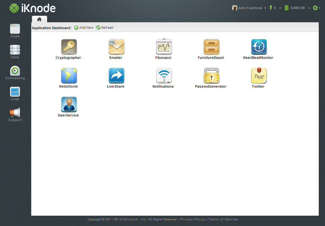
The first thing we tackled was the login. We felt the login seems old and resembled a Desktop application. The login is important, because this is the first thing you see when you log into iKnode. It had to be cleaner and attractive. So we remove most of the text, focused on making the login screen more iconic and easier to understand.
 |
 |
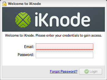
Instead of having the word “Email :” next to the email field we added an email icon, and next to the password field a lock. By removing the field labels the login screen automatically looked more pleasing and inviting, so we knew we were going in the right direction. We also simplified the welcome message. Nobody really reads it or pays attention to it, so we made it more functional; instead of a welcome message we replaced it with “Login or Create a new Account”.
Before you could only create an account from the main site, but we noticed that some tried to create an account directly from the login, so we added the link to the login.
The Sidebar
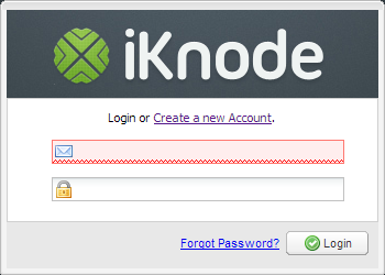
The second thing we focused our attention to was the ever growing sidebar. It had too many options and only a handful of options were really being used. But the biggest problem was that the sidebar didn’t make it clear what features were offered. Too many choices, and not a clear part on where to start.
 |
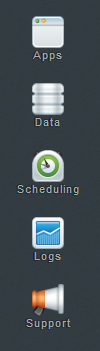 |
With the new sidebar we make clear that we have 3 main features: Backend Apps, Data Storage and Scheduling. The order is also set to let the user know where to start. The first thing to do in iKnode is create an App. Then create Data Stores and if needed Schedule some apps to run at a specified period in time.
The new sidebar also improves the usage for mobile devices where screens are smaller. For this iteration we focused completly on tablets like the iPad, Nexus 7 and the Surface RT. The sidebar buttons are now big enough for a very precise finger button click, when before you usually needed to zoom in.
Additionally we removed the “Feedback & Support” floating tab and added it to the sidebar. This decision was made to unify the design, the tab always looked out of place. With the Support button as part of the sidebar it feels more accessible and consistent.
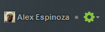
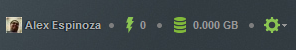
The Topbar
The third place we focused our attention to was the top bar. This top bar has changed considerably since iKnode started. In this time, we made the top bar a kindda scoreboard. We had the metrics on the dashboard before, but nobody really saw them, because most users spent their time coding in the editor. So we moved the stats to the top where they are visible no matter where you are in the site.
|
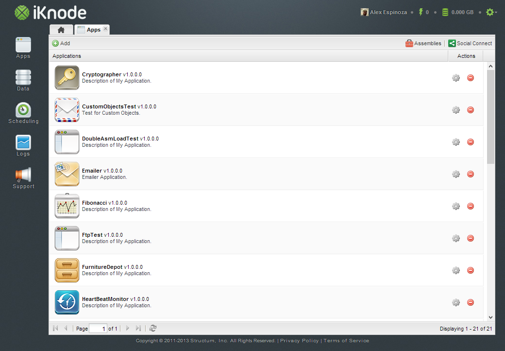
The Application List
The fourth item we decided to improve was the Application List. The application list used to look like a small desktop grid, which made usage in tablets very complicated because of the size of each row. What we decided to do was make the grid line higher and wider, with big buttons at the end. It still needs improvement, but the this is a start. We also added the Application icon to make applications easier to identify.
 |
The Editor
The fifth place and one of the most important ones is the editor. We have been working tirelessly to make the editor more usable. We are using ACE and for sometime we used a really old version of it. In the past month Jorge decided to put some love into the editor integrating the latest version of ACE and adding some well deserved keyboard bindings. It was frustrating to save an app by cliking the button. I usually save my code everytime I finish a line, which means that my development time was impacted considerably.
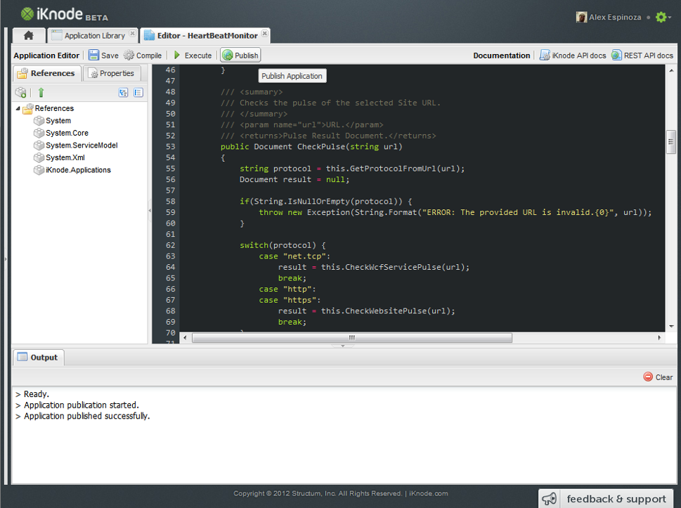 |
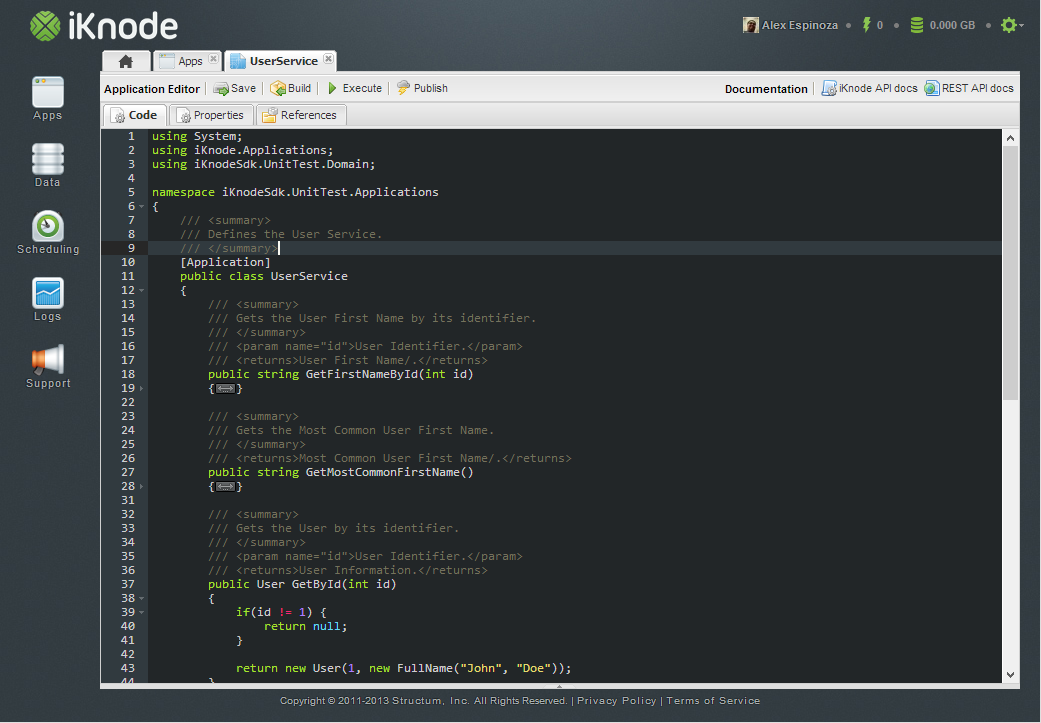 |
So in the editor, we first focused on making the code editor itself larger, so that we can focus on the code. The references and Properties that were part an editor sidebar were only used around 5% of the time, where the editor was used approximately 95% of the time. Additionally I am an avid Emacs user, and I love the simplicity of the editor with no toolbar, sidebar or anything else.
In order to achieve what a lot of developers call the “Zen Mode” we had to allow the editor to take the rest of the screen. So we moved the References and Properties tabs out of the way. We created a tab for the editor, one for the references and one for the properties. This made a hell of a difference. It feels like Emacs, and I love it.
We also changed the icons. We felt the Disk icon, which reprented the save process, was outdated. I think the Disk is no longer the best way to represent the save operation, so we changed to a Server Save icon.
This UI improvement experience was amazing. We had been so focused on pumping up our infrastructure that we overlooked the user interface. We put a lot of heart and love into iKnode, most of the time it can’t be seen with the naked eye, but in this case, it is out there for everybody to enjoy.
Please let use know your thoughts about the new changes.